The lingoscope project, involved working with a start-up based in the language education sector, to build a dynamic web-based product.
"Steve has put so much work into my business site against all the challenges faced"
"Steve has put so much work into my business site against all the challenges faced"
I approached a local business who I knew only used facebook to market her business. I then offered to carry out research activities with the clients customers, create designs and produce a dynamic website with CMS. The project was carried out on a part-time basis and with no budget.


Here, I had to build rapport and trust with the client, so I decided to run a semi-structured informal interview to establish some assumptions around the user groups, what would sustain the business and what the client wanted built.
Some KPI's that were translated:

One of the business goals for the client was to improve their workflow. In order to observe the client in their natural environment for a few hours and to try and gain valuable insights and stumbling blocks they encountered in their existing process. My goal here was to reveal the underlying work structure and then measure this through time and effort.
Goals:
To gather a greater understanding of the clients workflow
To determine the sequence of tasks
Understand the tools she chose to use and why they were favoured
To understand the environment she worked in and any pain points
I needed to understand the ongoing experience and not just a quick summary. Here I immersed myself in the clients workplace and carried out observational research with the occasional questioning to clarify understanding. The research data reflected reality because the client offered findings while she carried out work. Alongside this, I analysed the data to interpret it for meaning, before then attempting to understand it for applicable design solutions.
The main finding i observed was the complexity of different platforms being used to conduct daily work tasks. Furthermore, almost all applications were not integrated, causing lengthy intervals in between task completions. I recorded the times to complete a range of tasks to measure the effectiveness of the redesign.
After obtaining agreement from the client via an informed consent form, I recorded the session and later located a few signals that I didn't pick up on earlier.
The main question was formulated which I then turned into solutions.
@How might we synchronise existing platforms to increase productivity?'
Once the question(s) and some solutions were gathered, I formed a hypothesis.
I then planned to add software to the clients workstation to retrieve quantitative data. Once this had been done, the data returned would be analysed by comparing it with the numbers recorded earlier in the contextual enquiry session.
I would know that we were successful if we could reduce the clients daily workload by 12.5%, or 1 hour.
The problem was 2-fold: There was no budget and it took time to locate and learn the new software to solve the clients problem. Alongside this, I wanted to mitigate the hawthorne effect that was present, so I decide that in order to enhance confidence in the findings, I would try and triangulate the data and dismiss the first warm up questions in the session.
The solution was an integration with existing software, using zapier to connect and automate certain tasks.

I wanted to safeguard against any assumed solutions by spending enough time re-framing the problem. Usually i would conduct this design thinking activity at the define stage of the process, however due to the importance, it was started early and updated regularly as research data presented.
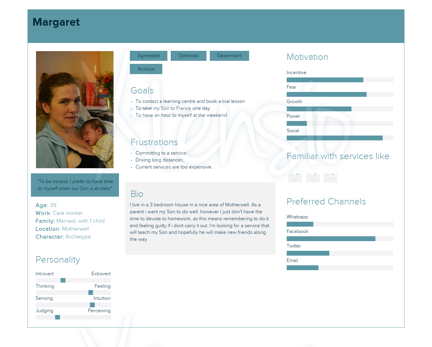
"We believed that by building an intuitive web-based product for parents, would achieve an error free, transparent user journey, which we know we will have succeeded when paid commitments to the service increased above 32%+ each month against existing successful signups."

Here i set out gathering as much primary and secondary data as i could on the business and the language learning sector, where at this stage we needed to know what constraints were were working with to define the scope and limitations.

3 user interviews were conducted (not 5 due to budgetary and time constraints) and the research findings were triangulated with the data from the stakeholder meeting. 2 of the 3 participants were users of the service, the other a representative.
This was a large project with limited data from which to benchmark the project moving forward. I set up a 2nd meeting with the client to further set out specific requirements to avoid scope creep. At this point I felt the client benefited from an informal chat about technical and monetary constraints which limited available options.

After collecting data, it became clear that 4 main user personas should be represented. Due to not gaining access to a schools representative, a proto-persona was created instead.
Here I needed to identify the key tasks users carried out, so by sorting out the higher frequency tasks via a matrix, the following red-routes were established. It was easy to complicate the project and feature solutions at this point and this is where I decided to prioritise the main routes users were taking.

As the user flows, sections and features of the site started to grow, I thought the best way to map the relationships between each component of the product was to establish a basic sitemap (a more complex flowchart was placed on hold solely due to time constraints). Alongside this, an X HTML sitemap was produced for search engine crawling, indexing and ranking purposes later on in the life cycle.

After actively listening to the client, I realised that the task of creating so much content was overwhelming and I had to devise a strategy that met the clients needs. This is where I broke this part of the project into manageable chunks (ongoing)
Content value proposition: Our content helps parents who are seeking a language learning service for their children, by adding value in convincing parents that lingoscope educates and entertains children in a fun way, by providing parents with space to relax and children with the opportunity to be entertained while learning.
at this point I wanted to track progress and compare the users experience against the clients defined goals.. Access to customers was going to be limited and pre-xisting analytical data was missing, therefore my methodological approach on this project was to collect metrics using a NPS survey and then perform moderated usability tests. This was dictated by constraints - mainly costs and time.
Initially I focused on specific features of the site - based on interview findings. Alongside this, I decided to look at new users to the service, as existing customers were largely loyal, where the clients priority was gaining paid custom.
I used the HEART framework to track and measure metrics for new users, focusing in on time on task, conversion rates, new visitors to the site and error counts as priority metrics focused on usability goals of efficiency and utility.
Next I conducted quantitative usability tests with a small set of users, then triangulated the data with a qualitative NPS survey. No external marketing factors influenced the survey at this stage of research. The results of the qualitative survey were bench marked against the educational sector NPS average of 52%. Also In absence of analytical data at this point, I wanted to measure against the clients-determined goals.
Having established a basic structure of the site so far, I needed to gain buy-in from the client and make sure this checkpoint took place, saving both myself and the client time and therefore money. Due to the messy iterative process, I like to include some sketches with stats relating to the problems identified. These tend to refocus my efforts back onto the problem rather than specific features.


The choice here was to use webflow SaaS, based on client functionality and the option to quickly embed custom code. I wanted to really simulate the interactions and have a base from which to look at the design context. At this point, the client increased their feedback and revision changes in a structured spreadsheet, however I did not want large amounts of documents, due to the lean ux process.

Moderated remote usability sessions are taking place using the think-aloud methodology. I will use pixel-perfect prototypes to test with a minimum of 3 users, using lookback software to analyse user behaviour, while providing each participant with a repeatable set of task scenarios. The output data will then be interpreted, analysed and represented as either a visual diagram or a summary to ensure agile practices are followed. Once the data has been collected, I will tie the user research insights with the clients business KPI's. Alongside usability testing, I made the decision to conduct dog-food testing due to the length of time accessing existing customers.
Here we needed to compare existing data against the efficiency of the redesign. Below are a series of annotated images from the existing problem to the proposed solution.

Earlier generative research showed users expecting a map function to locate the range of lingoscope venues. Here I needed to find out the most cost effective way to meet those needs. This is where I went back to the drawing board and created some wireframes around the design of the relational database/CMS within the site.

Here, I wanted to focu
After finding most usability issues, I expect several features will require bench-marking testing to validate user preferences. This will be completed using optimal workshop software. i like to then triangulate the data against SUS scores.
At this stage I decided to conduct an ongoing accessibility evaluation using the axe beta analytical tool to start making the product accessible for all users.
at the start of the evaluation I found in excess of 300+ issues that required attention. Following a plan, I attended to the most serious issues and cascaded down from there. The majority of issues involved missing ARIA attributes for screen readers, missing landmarks to group content and contrast issues according to WCAG 2.1 guidelines to meet AA (minimum) and AAA standards. after a general sweep for issues, I then had a detailed look at buttons, links, images, modals, keyboard interactions and forms, ensuring each element was inclusive.
My experience in recruiting participants for usability studies allowed me to start reaching out for suitable accessibility participants early, planning a 30 minute moderated session once the site was live, and then making sure the product met with WCAG success criteria.
Site files stored locally with backups. The client raised concerns around being left alone with a web product having low technical knowledge. As part of the digital strategy, I advised all files and documentation would be upload to GitHub and filezilla, so that any future designers/developers could access all relevant materials from which to build upon. This included training manuals for the client.
No analytical data made available until 20/11/20
No historical data has been presented yet.
Features to be implemented resulting from both data sets.
Below are projected success outcomes . Although iv'e outlined a few metrics here to help measure success, I want the metrics to grow alongside the users so that lingoscope can gain a competitive advantage as the product matures.
Client communications: In retrospect, I tried to include the client in various design stages, however, I realised that this was overwhelming the client alongside the pressures of business during this time, and changed course by only involving her at the necessary milestones. The client wanted to see results but not necessarily processes.
I also missed the opportunity to double check my findings with the client at the time of the contextual enquiry, which may have led to a possible failed design idea.
Scope: From a technical standpoint, I think i had taken on a larger project with more scope than i imagined. My time was taken up rectifying mark-up code, formatting issues and responsive design related challenges. In future, I would reverse the process and start with the basics, building from there by implementing more advanced features and animations, rather than trying to bridge the gap between the clients understanding and the design visions that presented.
Note-taking: Looking back at my reflection diary, it appeared most of the challenges related to communications, be that between client or users. One particular area was note-taking. Being a UX team-of-one on this project, I had to take notes as well as actively listen, where some notes made sense at the time but were misconstrued when interpreting the data. Subsequently, my workflow around not-taking has improved, with a clearer structure and the adoption of more advanced sketch note techniques to avoid confusion.
Minimalist design: Another important lesson i learnt on this project, was the challenges around scope and the importance of simplicity. I found myself often increasing the scope only to have to apply a minimalist approach later on.
Lean UX: I often learnt the hard way, through trial and error, which took too long and cost much more in time and finances. During each sprint, I developed a more efficient way of working, introducing more rapid research as i went along.
Content: I underestimated the time it would take to write top content and what I have learnt is that a copy-led strategy must take a higher priority, avoiding lorem ipsum and the formulation of structured frameworks and roadmaps to chart progress. Instead of a content plan taking place at one point in similar projects in the future, the change I would make would be to adopt a content first approach at every stage of the design cycle, testing regularly.
