Website design project to manage volunteers through a bespoke volunteer database management system with CMS using WebFlow.
Website design project to manage volunteers through a bespoke volunteer database management system with CMS using WebFlow.
This voluntary opportunity came about as a result of an advert for an Edinburgh based charity requiring the services of a web designer/graphic designer.

Here, I had to build rapport and trust with the client, by running a kick-off meeting to establish some data around the user groups, what would sustain the business and what the client wanted built.
One of the business goals for the client was to improve their workflow. In order to observe the client in their natural environment for a few hours, to try and gain valuable insights and stumbling blocks they encountered in their existing process.
I wanted to safeguard against the assumed solutions by spending enough time re-framing the problem. Usually i would conduct this design thinking activity at the define stage of the process, however due to the importance, it was started early and updated regularly as a living document.
The project was a large undertaking and it was imperative that rules and methods for communications were agreed upon from the start. It was important that during the design process, all components were aligned, where one way of keeping an eye on things was a solid user-centred strategy.

Initially, the client requested to be kept up to date at every stage, however this resulted in the client becoming overwhelmed, where it was decided that the communications would be structured at set intervals. The following tools were used to keep track of the project:

Here i set out gathering as much primary and secondary data as i could on the business and the sector.
To begin with, I used the volere specification process to gather functional and non-functional requirements in the form of a living document, from which to add through the whole iterative design process.
Nine user semi-structured interviews were conducted and the research findings were triangulated with the data from the stakeholder meeting.
Here i set out gathering as much primary and secondary data as i could on the business and the sector.
To begin with, I used the volere specification process to gather functional and non-functional requirements in the form of a living document, from which to add through the whole iterative design process.
This was a large project with limited data from which to benchmark the project moving forward. The scope had to be refined and understood early by way of a second stakeholder meeting to avoid scope creep.

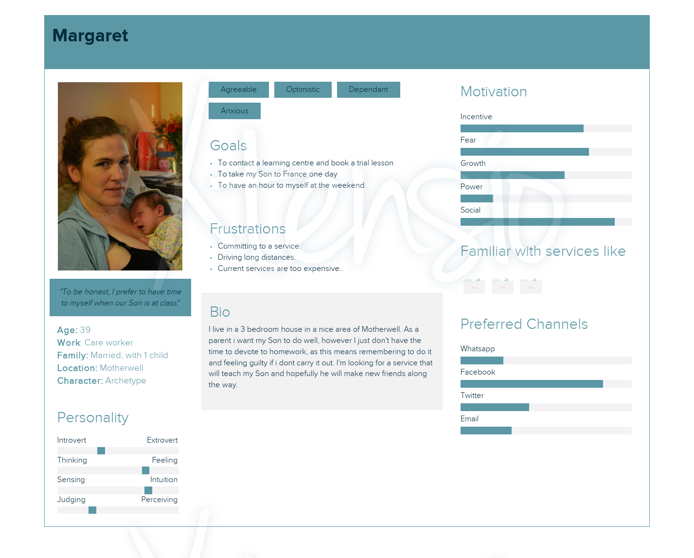
After collecting data, it became clear that 4 main user personas should be represented. The style of presentation was low-key because i was a ux team of one. Insights from the user interviews, highlighted that the child persona - early assumptions first thought this would be the main persona representation - had far less interactions concerning the product than most of the other personas.
After conducting an HTA activity, i needed to identify the key tasks users carried out. By sorting out the higher frequency and important tasks via a matrix, the following routes were established.

After the initial stakeholder meeting, collaboration had to be managed carefully due to the low technical knowledge the client had. After several lo-fidelity sketches and wireframes were produced for client collaboration, it was decided that communications had to be prioritised to avoid the project becoming overwhelming for the client. The following tools were used to keep track of the project:

several sketches were compiled to work with the content first strategy.

The business owner required a digital strategy as the project was a large undertaking and it was imperative that rules and methods for communications were agreed upon from the start.

Using webflow, the prototypes were created to get buy in from the client. at this stage, it was obvious the client wanted something soon and to closely resemble a finished website. At this point, the client increased their feedback and revision changes in a structured spreadsheet.

Moderated remote usability sessions are planned to take place - 3rd-4th weeks in August - where i will use the think-aloud methodology and summarise the findings alongside any insights that will inform revisions to the product. I will use pixel-perfect prototypes to test with a minimum of 3 users, using lookback software to analyse user behaviour, by providing each participant with a repeatable set of task scenarios related to the product. The output data will then be interpreted, analysed and represented as either a visual diagram or a summary.

After finding many of the usability issues, I expect several features will require bench-marking testing to see which one users prefer.
After finding most of the usability issues, I aim to assess the sites structure by conducting a class-based classification excercise, to triangulate the data with the previous card sorting method.
Code was embedded into the site to retrieve data from Google analytics dashboard. This was postponed due to client rebrandin exercise which affected domain and hosting.
GDPR - Cookies
Being a very important facet in the users experience, inclusive design has always been at the forefront of good design, this project was no exception. My workflow involved the following:

Ubersuggests and Hrefs alongside Google.
My knowledge of users was lower than i always hoped for (time and budgetary constraints), so i will decided to carry out a heuristic evaluation to identify any issues i may have missed. The urgency of meeting the deadline for going live, meant this method was preferred.
In retrospect, I felt that I created a relationship with the client that helped me as a designer communicate most of my thoughts at the beginning, which ultimately relied too much on her by way of involvement where she needn't be. In hindsight, I recognised her reactions and changed course by only involving her at the necessary milestones. The client wanted to see results but not processes.
From a technical standpoint, I think i had taken on a larger project with more scope than i imagined. My time was taken up rectifying markup code, formatting issues and responsive design related challenges. In future, I would reverse the process and start with the basics, building from there by implementing more advanced features and animations, rather than trying to bridge the gap between the clients understanding and the design visions that presented.
Looking back at my reflection diary, it appeared most of the challenges related to communications, be that between client or users. One particular area was note-taking. Being a UX team-of-one on this project, I had to take notes as well as actively listen, where some notes made sense at the time but were misconstrued when interpreting the data. Subsequently, my workflow around not-taking has improved, with a clearer structure and the adoption of more advanced sketch note techniques to avoid confusion.
Another important lesson i learnt on this project, was the challenges around scope and the importance of simplicity. I found myself often increasing the scope only to have to apply a minimalist approach later on.